2006 has been a stellar year for equities in general, as can be seen in the above table. European equities have been particularly strong, especially after taking into account the appreciation of the Euro versus other major currencies.
The following table summarizes the price performance of the main indices for the fourth quarter and the year of 2006.
| Fourth Quarter | Year | |||
|---|---|---|---|---|
| In local currency | In Canadian Dollars | In local currency | In Canadian Dollars | |
| S&P/TSX (Cdn) | +9.75% | +9.75% | +14.51% | +14.51% |
| S&P 500 (US) | +6.17% | +10.72% | +13.62% | +14.00% |
| Nasdaq (US) | +6.95% | +11.53% | +9.52% | +9.89% |
| Europe (EUR) | +6.82% | +16.01% | +17.68% | +31.52% |
| Nikkei (Japan) | +6.81% | +10.55% | +6.92% | +6.09% |
The Loonie stands at USD 0.8500, roughly one cent cheaper than at the beginning of the year, after a wild ride to a high of USD 0.9102. For those of you who are interested in finding out what drives the Canadian dollar, here is a chart that tells the tale:
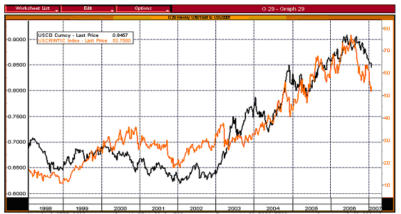
Canadian dollar vs US dollar (black) and Oil price in US dollar (red)
We could certainly say, at least for the last 7 years that AS GOES THE OIL PRICE, SO GOES THE LOONIE.
Entering 2007, as the economy slows down, the Federal Reserve sees no need to raise interest rates, at least for the foreseeable future. The housing market continues to be weak but the rate of decline has tapered. As rates stabilize, we could see housing starts growing again (albeit at a much slower pace) in the second half of the year.
In this era of connectivity that we live in, most people feel empowered by the ease of access to an infinite amount of information through the Internet. Just “google” anything and a plethora of articles will show up.
Those of you who watch the business news will notice that the ads shown on TV all emphasize one thing: “You have easy access to all the information you need to make a wise investment decision. With the filtering tools we provide you, you are in full control”. Or are you?
If you sit down and watch the business news every evening, you will notice that you are left with lots of data but little in the form of valuable information. In fact, much of what has been said is old news, noise and worse, just plain myths.
In the following section, with the help of a recently published investment book that we found extremely well documented, we will try to show you several charts in order to help you debunk some of the most conventional market myths that many investment decisions are based upon. As they say, “A PICTURE IS WORTH A THOUSAND WORDS”…
Myth # 1: High oil prices are bad for stocks.
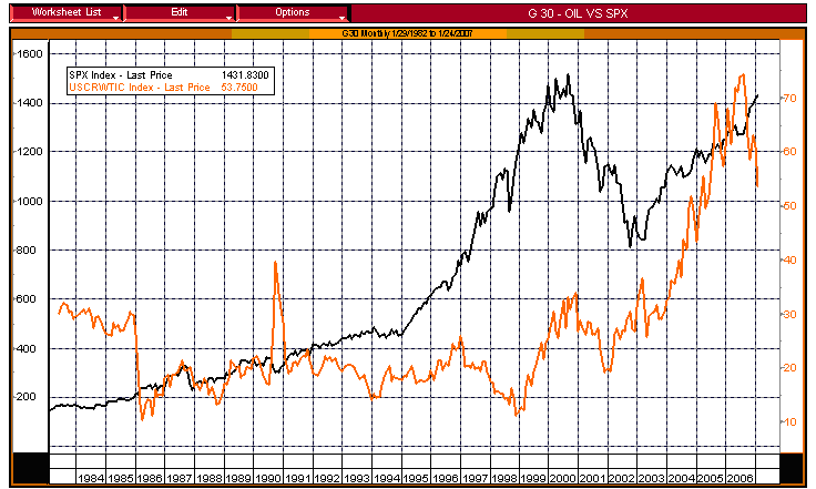
Oil Price (red line) versus the S & P 500 (black line)
Intuitively, we would be inclined to say by looking at the chart that over the last 23 years, there is no strong correlation between these 2 lines other than they both seem to rise over time, which is normal since most prices tend to rise over time with inflation.
Statistically, there is no correlation between oil prices and the S & P index. Now, you could find short periods of time when there seems to be some sort of relationship between the 2 variables but it is no more than random (an analogy would be that if you flip a coin 10,000 times, you know that you will get something very close to 5,000 heads and 5,000 tails. However, you could also find streaks of 10 or more heads (or 10 or more tails) in a row. Would that make it a predictive trend? Of course not! In this case, it is nothing more than chance because you know the exercise to be one of randomness).
Next time when you see headline like “high oil prices hurt stocks” in the newspapers, be skeptical. Stock prices could go down but it has probably nothing to do with oil.
Myth # 2: Hubbert Peak Oil Theory: we are running out of oil.
This theory, in a nutshell, says that oil discoveries have peaked (or are about to peak, depending on which studies you cite). If we do not curb our insatiable demand, we will run out of oil and the economic impact that follows will be disastrous.
Frankly, other than creating sensational headlines, these folks must have skipped Economics 101 the day supply and demand was taught. If the theory is right (which is a doubtful assumption), increasing demand and dwindling supply will make oil prices rise to where either a replacement source of energy will alleviate the supply pressure or demand will start to drop, or some combination of the two.
One thing is for sure: while the oil price is becoming expensive, a replacement will come along to power our cars and appliances. We don’t know what the source will be but it will happen. Necessity is the mother of all inventions. In the next century, the gas powered SUV will seem as quaint to our great-greatgrandchildren as the old fashioned windmill seemed to us.
Myth # 3: Trade deficits are bad for the economy, thus for stocks.
According to the next chart, not only can we say that it is good, we could almost conclude that bigger deficits are actually better for the market. Seems strange?
As a matter of fact, the only time when the trade deficit actually hovered around zero (i.e. almost no deficit at all) is from 1970 to 1982. Do you want to guess what the market did? The S & P 500 had gone from 92.15 in December 1970 to 111.96 in March 1982 for a price return of a measly 1.8% annually and 6.3% annually if dividends were reinvested.
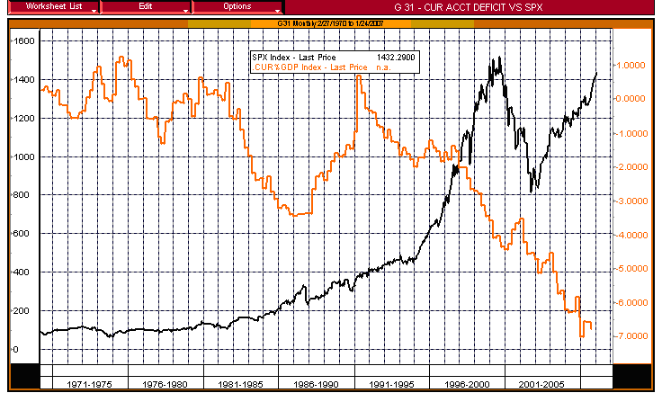
Current account deficit as % of GDP (red line) versus S & P 500 (black line)
Now look at the return on the S & P 500 since the trade deficit ballooned (since March 1991): even including the technology bubble burst, the index has had a compounded annual return of 11%, including reinvested dividends.
If inflation is added to the picture, the annual rate of return for the period 1970- 1982 was negative (since the average inflation rate during that period was 7%) while the return for the period 1991-2006 was around 9%, as the average inflation rate was about 2%. So, which era do you prefer?
We are not saying that big deficits are good. We just want to point out that zero deficits are not necessarily better. If only reporters and politicians could understand that current account deficits are signs of strength and not always weakness.
Enough with the myths for the time being as there are many more, too many for us to debunk. The investment book we base our letter on is close to 400 pages…
If you remember our quarterly letter in the summer of 2005, we had tabulated a series of best selling magazine cover pages that we used to “unscientifically” predict major turning points in financial markets. The last one on that letter was “HOME SWEET HOME” from Time magazine that, we suspected, would indicate the turning point on the home builders‘ index. Too bad we did not put our money where our mouth was as the index did drop more than 40% from July 2005 to July 2006!!!
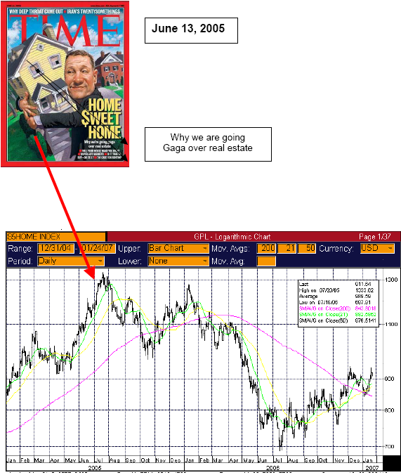
Standard and Poors 500 home builders’ sub index
(From January 2005 to January 2007)
We just identified a new one. Let ‘s see whether it will work…
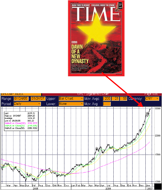
This is the Shanghai stock market index. Could it be that an ominous correction is coming? Let us reiterate that this is by no means a scientific conclusion. Then again, who says science can predict markets?
We hope you have enjoyed the reading.
Claret