Conventional wisdom, or is it?
As you must have read in every newspaper, the first quarter of 2012 was spectacular for worldwide stock markets. The US was up over 10%, Europe between 3% and 17% and Asia also over 10%. Sadly, the Canadian market lagged with a mere 3.5% return because of weakness in commodity prices.
As for the rest of the year, we are cautiously optimistic: this is an election year in the US and, if there was any reliable indicator in predicting the market, the presidential cycle would be on top of our list (by the way, it is a list of one…we don’t believe in predictions…)
Statistically, the 4th year of a presidential cycle is a fairly good year but not as good as the 3rd. The democratic system being what it is, politicians spend most of their time getting re-elected. Therefore, they can only do serious work (meaning putting into law, arduous and controversial bills — legislation) in the first 2 years of their boss’ term.
Let’s not forget that the end result of legislation is nothing more than the redistribution of wealth and/or property rights. The government takes from the rich and gives to the poor, or from the richer to the less rich, or from the poor to the poorer, or surprisingly, sometimes even from the poor to the rich (believe it or not, that does happen). As “political risk aversion” (i.e. the threat of legislation) increases in the first two years of a presidential cycle, the market, being a discounting mechanism, tends to be weaker. Year three then arrives and suddenly politicians find lots of creative ways of talking while doing very little in the form of passing any bills. The last thing they want to do is annoy their constituents as they prepare themselves for re-election. The market then starts discounting “political risk aversion” and moves higher.
Investing is not a game of certainty but one of probability. There are no fail-safes nor guarantees. And yet, investors demand absolutes from investing. This leads to some serious errors in judgement. A common mistake is an investor’s acceptance of some conventional wisdom that leads them to erroneous decisions. Moreover, a plethora of market “untruths”, myths and misconceptions are repeated on TV or in the newspaper so often that investors perceive them as factual.
We will try to undo some of these “conventional wisdoms” through graphs (a picture is worth a thousand words) and data verification (thank goodness for the Internet!), and some correlation calculations (for the numbers oriented readers).
THE STRONG DOLLAR IS GOOD FOR THE MARKET…OR IS IT?
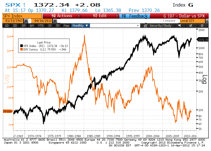
US Dollar Index versus the S & P 500 (Source: Bloomberg)
The chart above shows the performance of the US dollar composite (DXY) index versus the S & P 500 stock market index (SPX). The DXY is calculated by averaging the exchange rates between the US dollar and major world currencies. As you can see, it is difficult to come up with any conclusion whether or not a strong dollar is good for the stock market. In fact, if you look at the entire period (1967 to now), you would tend to conclude that a weak US dollar is good for the stock market. Then again, the market tends to go up ? of the time in the long run. Therefore any conclusion would be at best a wild guess and we are not very good at that. Indeed, we did run a correlation calculation and found that basically, none exists.
HIGH OIL PRICES ARE BAD FOR MARKETS. WE ARE NOT SO SURE….
What about oil prices? Are they bad for stocks? Again, it is difficult to justify with historical data that there is any correlation between oil and stock prices. We can only say that when oil prices are relatively stable, it is generally positive for stocks and when they are volatile (up or down), it is inconclusive. Indeed, there is no conclusive evidence whether oil prices lead stock prices or vice versa.
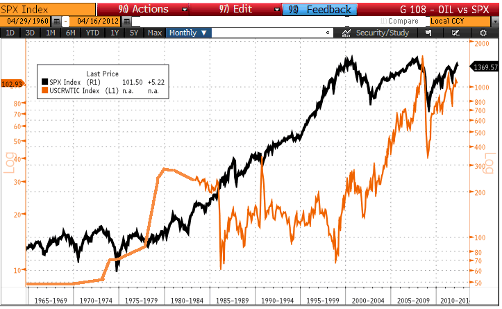
Historical oil price versus the S & P 500 since 1965 (Sources: Bloomberg, Chartsbin.com)
For a longer-term perspective, we have included another chart (below) which shows oil prices over a much longer time frame. While the red line indicates oil price in nominal dollars, the green line indicates the “inflation-adjusted” price of the commodity, expressed in 2009 constant dollars.
As you can see, there are 3 instances where oil prices reach those of today over last 150 years. The previous 2 times, they have subsequently collapsed. Maybe the Chinese growth rate combined with the Hubbert Peak Oil theory (theory that states that oil reserves worldwide are declining) could push oil prices to USD 150.00. Then again, maybe not. An alternative source of energy could be discovered that could make the price of oil look expensive, just as dinosaur oil made whale oil look expensive 150 years ago. We don’t pretend to know the answer; however, our analysis convinces us that the correlation between oil and stock prices is at best mildly negative. But in most time periods, it is non-existent.
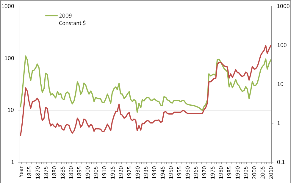
Historical Oil Prices since 1861 (Source: Chartbins.com)
THE COMING ECONOMIC IMPLOSION LED BY UNSUSTAINABLE US PUBLIC DEBT
How about the US public debt? $15 trillion US! Most people probably can’t even imagine how big the number is. Here it is… $15,000,000,000,000 US!
Firstly, let’s put things into perspective. Out of the $15 trillion US, the US federal government owns roughly 36%, basically by lending money to itself. That leaves roughly $10 trillion US owned by others (domestic & foreign investors, public pension plans, state governments and foreign governments).
Granted, it is still an astronomical number for most people. Big numbers are always scary but in the proper context, they may look a lot less scary and sometimes can become quite understandable. So let’s do that.
Will the US public debt sink its economy? This has been in the news for at least the last 3 years. With all the economic turmoil in Europe, it is understandable that the US public debt is such a hot topic.
Although we agree that too much debt cannot be a good thing, we just want to emphasize that defining the concept of “too much” is not as easy as one might think. Companies borrow to optimize their balance sheet and increase their return on equity. Governments borrow to make long term public investements like roads, highways, water systems, for which we can call “good debt”. They also borrow for social programs, which represents “bad debt”.
A good way to look at the debt picture is to compare it as a percentage of Gross Domestic Product (GDP). Just like a company, the bigger the GDP (revenues), the more profits it can generate and thus the more debt it can carry.
Let’s look at the US public debt as a % of its GDP. The chart below shows the long term historical ratio.
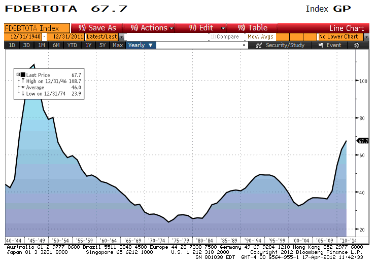
US Total Net Public Debt to GDP (%) (Source: Bloomberg, US treasury)
As we can see, it stands at roughly 68%. It had gone as high as 100% during World War II. Most ecomomists have stated that while it was normal that debt rose to an extreme level to fund the war, today’s level was reached in peace time and is unsustainable.
Yet, during the late 1940s and the early 1950s, while the debt-to-GDP ratios were much higher than today’s, that period was not remembered as economically troubled nor even a time of high debt. Moreover, if the population is conscious of the current high level of debt, it might motivate some politicians to focus on lowering it, or at least, preventing it from going higher.
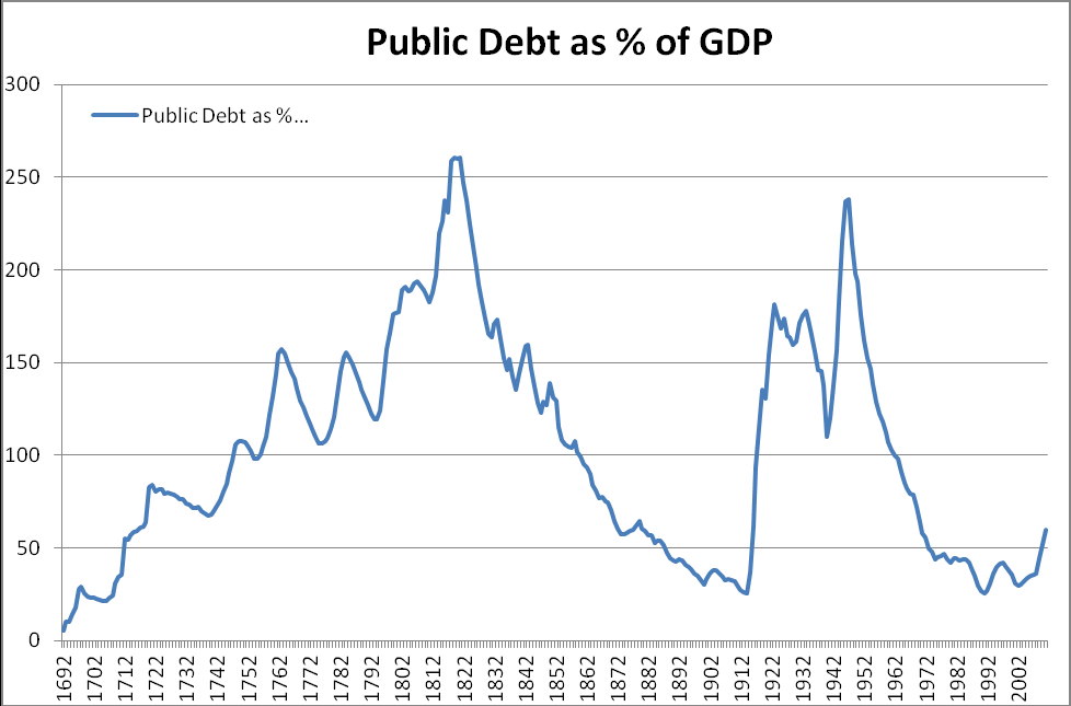
While researching history to find similar cases of high debt, we found a very interesting case in the United Kingdom. Look at the chart below.
By the way, in order to reduce the debt-to-GDP ratio, we (individuals, corporations, governments) can either save to pay back the debt or we can encourage GDP growth. Either action would reduce the ratio.
Judging by how irresponsible and misleading our governments and politicians are in general, it is probably wiser to count on the hard work and ingenuity of the population to grow GDP than on the willingness of the government to cut spending. We would venture to say that in most cases when the debt-to-GDP ratio fell, it had far more to do with growing GDP than falling debt levels. But that’s ok as far as we’re concerned. As Deng Xiao Ping once said (Chinese politician), it does not matter whether it is a white cat or a black cat, as long as it can catch mice…
Please, feel free to give us your comments and your views. It is always refreshing to be able to see the other side of any story.
The Claret Team